
Getting Started with Figma: From Zero to First Design
Learn the essentials of Figma in this beginner-friendly guide. We’ll walk you through interface basics, creating your first frame, and organizing your workspace.
Read Article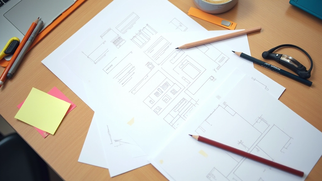
Discover practical wireframing methods used by top UX designers. We’ll cover low-fidelity sketches, digital wireframes, and how they connect to your final prototypes.

Wireframing is one of those design fundamentals that never gets old. It’s where ideas meet structure before you invest hours in visual design. Whether you’re building a mobile app, redesigning a website, or prototyping a new feature, a solid wireframe saves time and prevents costly revisions down the line.
The thing is, most designers skip this step or rush through it. They’ll jump straight into Figma and start pushing pixels around. But that’s when problems emerge. Missing information hierarchies. Confusing user flows. Layouts that don’t actually work on smaller screens. We’ve all seen it happen.
Good wireframing forces you to answer the hard questions first. What information does the user need? In what order? How do they navigate from one section to the next? It’s thinking without distraction — no colors, no fancy effects, just pure structure.

Different situations call for different techniques. Here’s what we use most often.
Start with paper and pencil. Quick, rough layouts that take 5-10 minutes per screen. You’re exploring possibilities, not perfecting details. This is where you test multiple directions and get feedback fast.
Move to tools like Figma or Balsamiq once the concept is solid. Digital wireframes add precision — proper spacing, alignment, and responsive behavior. You’re getting closer to the real thing without committing to visual design yet.
Build clickable flows that show transitions and interactions. Users can actually navigate through screens and see how the experience feels. This catches problems that static wireframes miss.
List everything that needs to appear. Headlines, body text, images, buttons, forms — everything. Don’t leave anything to assumption.
Create 3-5 different approaches. One column vs two columns. Hero image at top or side. Navigation sticky or scrollable. Try variations.
Show sketches to teammates or users. You’ll spot issues now instead of after visual design. It’s way cheaper to change a sketch than to redo high-fidelity designs.
Move your best concept to Figma. Add real spacing, grid alignment, and responsive breakpoints. Make sure it actually works on mobile, tablet, and desktop.

You don’t need expensive software. These are the tools we recommend for wireframing at any level.
The industry standard. Collaborate in real-time, create components, build interactive prototypes. It’s where most teams spend their time once wireframes are approved.
Still the fastest way to explore ideas. Grab a notebook and start sketching. Zero learning curve, zero distractions. Perfect for brainstorming sessions.
Purpose-built for wireframing. Low-fidelity aesthetic keeps you focused on structure, not visual polish. Great for teams that want to move fast without overthinking.
Solid option if your team’s already in the Adobe ecosystem. Handles wireframes, prototyping, and handoff documentation in one place.

Add color, shadows, and detailed icons and you’re not wireframing anymore — you’re designing. The goal is structure, not aesthetics. Keep it grayscale and simple.
Design for desktop first and you’ll regret it later. Wireframe mobile, tablet, and desktop from the start. Mobile is harder — solve that problem early.
A beautiful wireframe that doesn’t solve the user’s problem is worthless. Test the flow. Can users actually complete the task you designed for?
This article provides educational information about wireframing techniques and methodologies. The approaches described here are based on industry practices and our teaching experience. Every project is unique, and results depend on proper execution, team skills, and project requirements. We recommend adapting these techniques to fit your specific context and consulting with experienced designers when tackling complex projects.
The best wireframing approach is the one your team will actually use. Don’t overthink it. Start with pencil and paper, get feedback, move to digital tools, and build from there. The structure you create now will guide everything that comes after — your visual design, your development, your user experience.
Wireframing isn’t about creating perfect pixel-precise documents. It’s about solving problems before they become expensive. It’s about clarity. It’s about making sure everyone — designers, developers, stakeholders — understands what you’re building and why. That shared understanding is worth far more than any fancy design file.