
Start with a Clear Foundation
Before you create a single component, you need alignment on why you’re building this.
Here’s what we’ve seen work: teams that document their design system’s purpose first succeed. Not the purpose statement for the website — the actual reason your team exists. Are you solving for speed? Consistency? Accessibility? Probably all three, but one should be the primary driver.
Start by documenting your design principles. At DesignHub, we use five core principles that guide every decision. They’re simple: clarity, consistency, efficiency, accessibility, and flexibility. When someone asks “should we add this component?” you check it against those five things.
Most teams skip this step. They jump straight to building components. Then six months later, designers are arguing about button padding because there’s no shared philosophy. Don’t be that team.

Design Tokens: The Backbone of Scalability
Tokens aren’t just for developers. They’re how you keep everything consistent.

Design tokens are the values — colors, spacing, typography, shadows — that you reuse everywhere. Instead of saying “blue #3B82F6”, you say “primary-action”. When you change the token value once, it updates across your entire product.
We organize tokens in four layers. Foundation tokens are the raw values — colors, sizes. Component tokens apply those to specific UI elements. Pattern tokens group components together. And variant tokens handle states like hover, active, disabled.
The naming convention matters. We use semantic names, not descriptive ones. “Primary-action” instead of “bright-blue”. This way, if your brand evolves and primary becomes purple, the name stays the same. Developers don’t need to update their code.
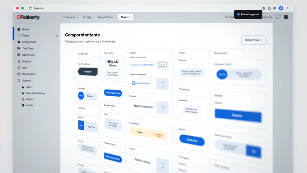
Building Components That Work Together
Components should be atomic, flexible, and well-documented.
Start small. Don’t create 200 components in week one. Begin with primitives — buttons, inputs, cards, typography. Get those right. Then build from there.
Each component needs clear documentation. Not just a screenshot. We document: what it’s for, when to use it, when NOT to use it, available states, accessibility requirements, and code examples. That sounds like a lot, but it saves hours of back-and-forth.
Crucially, components need to be composable. A button shouldn’t be locked into a specific width or layout. It should work inside a card, in a form, as a standalone element. The more flexible your components, the fewer you’ll need to create.
The system fails when it becomes a bottleneck. If designers need approval to use a component, or developers have to file a ticket to request a new variant, you’ve built something too rigid. Flexibility with consistency is the balance.
Making Your Team Actually Use It
A perfect system nobody uses is worthless.

This is where most systems die. You build something amazing, launch it with excitement, and then… crickets. Three months later, someone’s building a custom button because they didn’t know the system existed.
You’ve got to embed the system into your workflow. Use it in your design critiques. Reference components by name. When someone creates something custom, ask: “Is there a component for this?” Make it part of the conversation.
We also maintain a “system dashboard” — a living doc that shows what’s been updated, what’s coming, and where to find things. It’s not fancy. Just a Notion page. But it keeps the system visible and reminds people it exists.
Planning for Growth and Evolution
A design system is never finished. It needs an owner and a process.
Assign someone to own the system. Not full-time necessarily, but someone who decides what gets added, manages requests, and keeps it clean. Without an owner, the system becomes bloated with unused components and inconsistent documentation.
Create a request process. When teams need a new component, they submit a request with context. The owner evaluates: can we use an existing component? Can we modify one? Do we genuinely need something new? This prevents component sprawl.
We do quarterly reviews. Look at what’s being used, what’s ignored, what’s breaking. Update documentation. Retire old components. Keep it fresh. It takes maybe 8 hours a quarter, but it’s worth it.

About This Guide
This article provides educational information about design system best practices based on industry standards and our experience at DesignHub Academy. Every team’s needs are different — what works for a 5-person startup may not work for a 100-person enterprise. Use these principles as a framework and adapt them to your context. Results will vary based on team size, product complexity, and organizational structure.
Build It, Use It, Maintain It
A design system that actually gets used is one where the entire team understands why it exists. It’s not imposed from above. It’s built collaboratively. It solves real problems. And it’s maintained with care.
Start small. Document everything. Get feedback. Iterate. Make it part of your culture. In 6 months, you’ll wonder how you ever shipped products without one.
Ready to build a system for your team?
Get in touch with our instructors