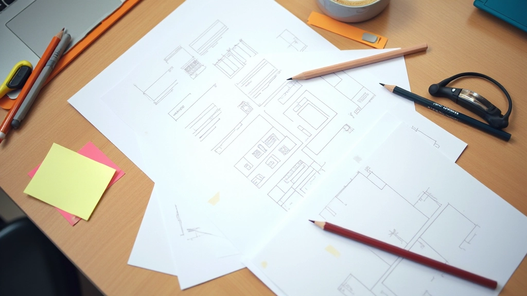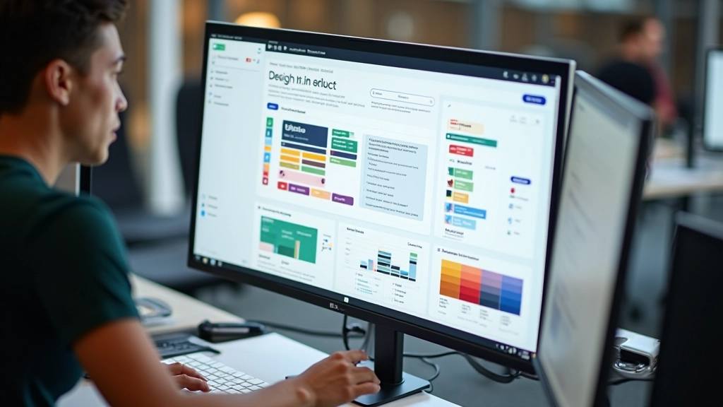
Getting Started with Figma: From Zero to First Design
Learn the essentials of Figma in this beginner-friendly guide. We’ll walk you through the interface, basic tools, and how to create your first design file from scratch.
Read More
Master meaningful motion design that communicates intent to developers and delights users. Learn micro-interactions, timing curves, and how to prototype animations that actually work in production.
Animation isn’t decoration. It’s communication. When you get it right, users understand what’s happening, where to look next, and why something moved. When you get it wrong, you’ve wasted milliseconds that feel like hours.
We’re going to walk through how professional designers approach prototyping with motion. You’ll learn the difference between transitions that feel good and ones that feel sluggish. You’ll understand easing functions — what they do, why they matter, and how to talk about them with your development team. By the end, you’ll have a real framework for building prototypes that communicate motion intent clearly.
Here’s the thing: static mockups don’t tell the whole story. A button that appears instantly on a static screen feels broken when it animates in real life. Modal dialogs that pop in without easing feel jarring. Form validation that appears with zero transition feels harsh.
Motion is the glue between states. It shows users that something happened, guides their attention, and creates a sense of responsiveness. A 200-millisecond transition on a button hover doesn’t sound like much, but it’s the difference between a product that feels alive and one that feels mechanical.
When you prototype with motion, you’re not just making things look nice. You’re testing whether the interaction pattern actually works. Does the animation duration feel right? Can users predict what’s going to happen next? Are there any jarring moments where the motion contradicts the user’s expectations? These are questions you can only answer by seeing motion in action.


Linear motion doesn’t exist in nature. If you move something from point A to point B at constant speed, it feels robotic. Real-world objects accelerate and decelerate. A door opening slowly at first, then faster in the middle, then slowing as it approaches the frame. That’s natural motion.
Easing functions replicate this. You’ve got several common types: ease-in (starts slow, speeds up), ease-out (starts fast, slows down), ease-in-out (slow start, fast middle, slow end). Most UI animations use ease-out or ease-in-out. Why? Because ease-out feels responsive — it makes the user feel like their action caused an immediate result.
Pro tip: For micro-interactions (button hovers, icon changes), use 150-300ms with ease-out. For larger state changes (modal opens, navigation slides), use 300-500ms with ease-in-out. Anything slower than 500ms starts to feel sluggish.
Disclaimer: This guide provides educational information about animation and prototyping principles. Actual implementation will vary based on your specific tools, design system, and project requirements. Always test animations with real users and across different devices to ensure they perform well and feel responsive.
Micro-interactions are the small animations that happen in response to specific user actions. Button hover states, loading spinners, form field focus states, checkbox checks. Each one is a tiny moment where your product can feel either polished or neglected.
The best micro-interactions do three things: they’re immediate (under 100ms feels instant), they’re obvious (the user knows something happened), and they’re relevant (they acknowledge the action the user just took). A checkbox that animates as it checks feels intentional. A form field that pulses slightly when focused helps the user understand they can type. A loading spinner that rotates smoothly tells the user the system isn’t frozen.
When you’re prototyping, don’t skip the small stuff. Build micro-interactions into your prototype from the start. They’re often what separates a good product from a great one.


Here’s where a lot of designers trip up: they create beautiful prototypes but then don’t know how to tell developers what they built. “Make it feel natural” isn’t a specification. Developers need numbers.
When you hand off a prototype, include three pieces of information for every animation: duration (in milliseconds), easing function (ease-out, cubic-bezier, etc.), and the properties being animated (opacity, transform, etc.). A modal that fades in over 400ms using ease-out opacity is clear. “Make it fade in smoothly” is not.
Building interactive prototypes with animation isn’t about making things flashy. It’s about making things clear. Every animation you add should serve a purpose: guiding attention, showing state changes, creating a sense of responsiveness, or helping users understand what’s happening next.
Start by identifying the key interactions in your product. Which state changes need motion? Where can micro-interactions make a difference? What would help users feel like they’re in control? Then prototype those animations. Test them. Adjust the timing until they feel right. Finally, document them clearly for your development team.
The products that feel best aren’t necessarily the most animated — they’re the ones where motion is thoughtful, purposeful, and invisible. When users interact with your prototype, they shouldn’t think about the animations. They should just feel like everything is responsive and alive.